Custom Banner
Introduction
The banner accepts multiple templates which are used to construct the banner:
- fitting-banner: The banner displayed if at least one fitting, in-stock size for a product exists
- non-fitting-banner: The banner displayed if there is no fitting or in-stock size for a product
- in-stock-item: The element displayed for each fitting, in-stock item
- out-of-stock-item: The element displayed for each fitting, out-of-stock item
The details on how these templates get used and put together are explained in the following sections.
Fitting Banner
The fitting banner template gets used if there is at least one fitting size for a particular product. It has two slots available:
- label: Gets replaced by a text similar to "Recommended size:" in the same language as the widget uses.
- items: This is where the
in-stock-itemandout-of-stock-itemtemplates get inserted (one per fitting size).
The following chart should help in clarifying how everything gets put together:
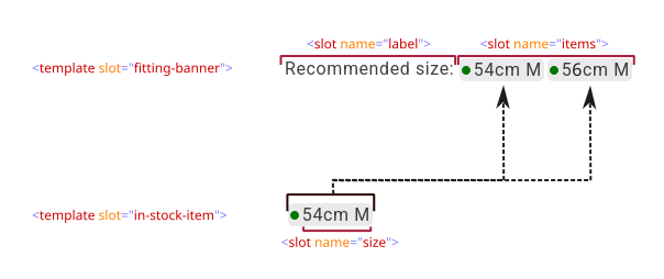
The following templates are used for the above illustration:
- HTML
- CSS
<template slot="fitting-banner">
    <slot name="label"></slot>
    <slot name="items"></slot>
</template>

<template slot="in-stock-item">
    <span class="stock">
        <span class="indicator"></span>
        <span>
            <slot name="size"></slot>
        </span>
    </span>
</template>

<template slot="out-of-stock-item">
    <span class="stock">
        <span class="indicator bad"></span>
        <span>
            <slot name="size"></slot>
        </span>
    </span>
</template>
.stock {
    display: inline-flex;
    align-items: center;
    gap: 0.25rem;

    padding: 0.25rem;
    margin-right: 0.25rem;

    border: 0;
    border-radius: 5px;

    background: #EAEAEA;

    line-height: 1;

    > .indicator {
        display: inline-block;

        width: 8px;
        height: 8px;

        border-radius: 50%;

        background: #007600;

        &.bad {
            background: #901313;
        }
    }
}

If you want to supply your own text (or remove it), simply replace the <slot name="label"> with text:
- HTML
- CSS
<template slot="fitting-banner">
    The following sizes fit you:
    <slot name="items"></slot>
</template>

<template slot="in-stock-item">
    <span class="stock">
        <span class="indicator"></span>
        <span>
            <slot name="size"></slot>
        </span>
    </span>
</template>

<template slot="out-of-stock-item">
    <span class="stock">
        <span class="indicator bad"></span>
        <span>
            <slot name="size"></slot>
        </span>
    </span>
</template>
.stock {
    display: inline-flex;
    align-items: center;
    gap: 0.25rem;

    padding: 0.25rem;
    margin-right: 0.25rem;

    border: 0;
    border-radius: 5px;

    background: #EAEAEA;

    line-height: 1;

    > .indicator {
        display: inline-block;

        width: 8px;
        height: 8px;

        border-radius: 50%;

        background: #007600;

        &.bad {
            background: #901313;
        }
    }
}

Similarly, if you want to show the user that some size fits, but not list all the sizes, simply remove the <slot name="items">:
You can remove the <template slot="in-stock-item"> and <template slot="out-of-stock-item"> in this case, as they would be inserted in the slot that was just removed.
- HTML
<template slot="fitting-banner">
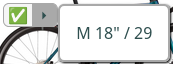
Fits you ✅
</template>

Non-Fitting Banner
The non-fitting banner template gets used if there is no fitting size for a particular product. It has only one slot available:
- label: Gets replaced by a text similar to "Recommended size:" in the same language as the widget uses.
A basic example:
- HTML
- CSS
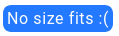
<template slot="non-fitting-banner">
    <span class="sad">No size fits :(</span>
</template>
.sad {
    padding: 0.25em;

    color: white;
    background: #2379ff;

    border-radius: 8px;
}
If, instead, you want nothing to be shown in the case of no fitting sizes, simply keep the template empty (or don't include it at all):
- HTML
<template slot="non-fitting-banner">
    <!-- kept empty as we don't want to show anything in this case -->
</template>
Nothing to show here
Examples
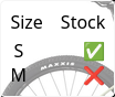
Vertical List
- HTML
- CSS
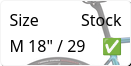
<template slot="fitting-banner">
    <div class="table">
        <div class="row">
            <span>Size</span>
            <span>Stock</span>
        </div>
        <slot name="items"></slot>
    </div>
</template>

<template slot="in-stock-item">
    <div class="row">
        <span>
            <slot name="size"></slot>
        </span>
        <span>✅</span>
    </div>
</template>

<template slot="out-of-stock-item">
    <div class="row">
        <span>
            <slot name="size"></slot>
        </span>
        <span>❌</span>
    </div>
</template>
.table {
    display: flex;
    flex-flow: column nowrap;
    gap: 0.25em;

    padding: 0.5em;

    background: rgb(255 255 255 / 0.4);

    border: 1px solid whitesmoke;
    border-radius: 5px;

    backdrop-filter: blur(8px);
}

.row {
    display: flex;
    flex-flow: row nowrap;
    justify-content: space-between;
    gap: 0.5em;
}
Be aware that you cannot use a nested statement like .table > .row, only .table .row, for the items. The reason is, that the <slot name="items"> gets wrapped internally.
Detailed Info on Hover
- HTML
- CSS
<template slot="fitting-banner">
    <div class="banner">
        ✅
        <div class="details">
            🞂
            <div class="overlay">
                <slot name="items"></slot>
            </div>
        </div>
    </div>
</template>

<template slot="non-fitting-banner">
    <div class="banner no-fit">❌</div>
</template>

<template slot="in-stock-item">
    <div class="item">
        <slot name="size"></slot>
    </div>
</template>

<template slot="out-of-stock-item">
    <!-- intentionally left empty -->
</template>
.banner {
    display: flex;
    flex-flow: row nowrap;
    align-items: center;
    gap: 0.2em;

    padding-left: 0.3em;

    background: whitesmoke;

    border: 1px solid darkgray;
    border-radius: 6px;

    &.no-fit {
        padding-right: 0.2em;
    }

    > .details {
        position: relative;

        color: darkslategray;
        background: darkgray;

        padding: 0 0.5em;

        border-top-right-radius: 4px;
        border-bottom-right-radius: 4px;
    }

    .overlay {
        display: flex;
        flex-flow: column nowrap;
        gap: 0.25em;

        position: absolute;
        top: 0;
        left: calc(100% + 1px);

        padding: 1em;

        background: white;

        border: 2px solid darkgray;
        border-radius: 6px;

        box-shadow: 1px 1px 2px black;

        visibility: collapse;
    }

    &:has(.details:hover) .overlay {
        visibility: visible;
    }

    .item {
        white-space: nowrap;
    }
}
No fitting sizes:

Fitting sizes:

On Hover: